When designing a website, there is one thing to keep in mind – Keep it Simple! In all honesty, isn’t that a rule of thumb across all areas of life? It is best to keep everything as simple as possible. In particular, people tend to be visually interested by the simplest aesthetics. Sure, complex graphics are “cool” but they are also often distracting.
In general, people want to be able to look at things and know what they are. If you are designing a site for a clothing retailer, it is best to make sure that the site is similar to others in its category. It is also smart to give people what they expect (at least to an extent).
You are thinking, “BORING!” Right? Wrong…
Simple = LESS?
The quick answer to that is NO.
Simple doesn’t mean that you can’t create a beautiful, interesting site with links, ads and stunning graphics. Simple means making sure that your user “gets” it. Make what you want your user to do obvious, and make it easy for them to take that action. Sometimes, when designing or creating something, we forget that the users, readers or consumers are not IN OUR HEADS. They don’t know what we meant for something to represent. They aren’t able to read between all of our lines. They want to know what to do, so that they can do it. They need clear and concise calls to action. They want you to tell then what to do next and how to do it.
Take for example a recent experience I had with my Nespresso espresso machine:
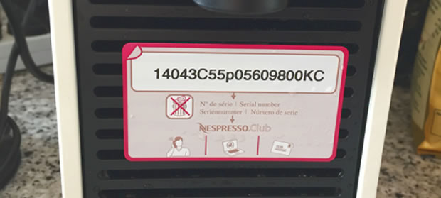
I got it as a gift and when I was checking it out, I found this on the back. I wondered to myself what the number was for and why this sticker was on my machine. Is it a serial number, or how is it related to the Nespresso club? It got me thinking about 3 things concepts which can be applied to web design.
- First, it is important be very clear and direct. Even if something is clear to you, you should clearly write exactly what you want visitors to do.
- Second, I didn’t have a strong desire to find out what this number meant because it had no clear benefit to me. It is important to not only tell customers what to do, but how that action will benefit them.
- Third, simple is important but it doesn’t mean it’s the easiest. This sticker was definitely simple, but missing key information. Websites need to be drilled down to the most important, concise information and then have all the fluff stripped away.
Now with that in mind, imagine if this sticker said “Use this number to register your espresso machine online to view your warranty information and to receive free recipes once per month. Problem solved, and a happy customer is created.
Why Simple is Scientifically Better
The human brain can handle a wide array of stimuli at once. It is a complex machine. However, the more imagery, color and general sensory stimuli that we throw at a human brain, the more distracted and confused it will become.
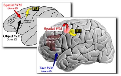
If your goal is for people to not just visit the site, but also stay and click links or buy products, then you must be cognoscente of how much you are presenting to people upon arrival to your site. The point is not to give people a small amount of information, necessarily. The point is to give them the least number of elements that is necessary. This is because there is a lot of evidence to show that a human can only remember from 5 to 9 “chunks” of information or data at a time. That’s their “working memory.” If you include much more than that, and you lose them.
There is no magic formula to help you decide how many elements to include.
The entire point of web design is to find that balance. That’s your whole job. You need to think about everything from typography, to color selection to logo and everything in between. Then, you decide how much is JUST enough. It’s not easy, but it’s the way that the best design is achieved.
Think of writing – writers are always encouraged to communicate their point in as few words as possible. The extremely longwinded writer adds too many details and will bore or overwhelm the reader. The writer who can write just enough, but not too much, will captivate readers. If you have ever read a great novel, then you know what we’re talking about. Conversely, if you have ever put a book down after the first chapter, you can probably also relate.
Users will disengage if they are overstimulated or are not sure how to interpret the information that they are taking in. Which brings us to the next point…
Prototypicality
That’s a mouthful but it means that you need to meet user expectations. Are you designing a news site? An e-commerce shop? An informational site? The type of site that is being designed matters. People are looking for certain things from certain sites, and they want them to look the way that they are used to seeing them. When you make a site simple, that does not mean that you cut everything out. It also doesn’t mean that your site can’t have any pizzazz, color or personality. And, be clear on this, do not feel that you have to do things exactly as others have. The point is to consider consumer expectations when beginning your design and choosing your template.
When you make a site simple, that does not mean that you cut everything out. It also doesn’t mean that your site can’t have any pizzazz, color or personality. And, be clear on this, do not feel that you have to do things exactly as others have. The point is to consider consumer expectations when beginning your design and choosing your template.
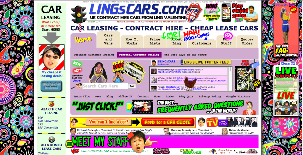
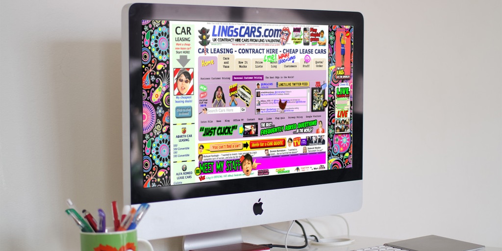
http://www.lingscars.com
Cognitive Fluency
You don’t need to create a barren and bleak site. Please don’t. You just need to be careful about what you add and have good reasons for it. Remove anything without value. How do you know if it has value? Ask yourself this:
“Does it make the user’s experience simpler and easier?”
If the answer is yes, keep it. If not, toss it. That’s what cognitive fluency is all about. People want to do the easiest thing. Of course. Think about the guy who knows nothing about the site, the product, the service or, heck, even the internet. Design your site with him in mind. How can you make this site so clear and concise that people will be able to use it with ease?
A Simple Case Study
A website designed to sell ties was outdated. It no longer fit into the prototypical ideas of what people expected to see when they visited an online retailer site. Its sales were suffering. What did they do? A redesign! What happened? They sold more ties!
Was the redesign based on what was prettiest or coolest? No. The old site might have been considered prettier. Was the new site more complicated? No. It was simpler. Did the new site use amazing graphics? No.
They simply redesigned their site to meet customer expectations and to be as user-friendly as possible. They based their new design on prototypicality, user testing and cognitive fluency and had great success!
You may be tempted to throw all of your options into a site, often because you can and it is cool.
You may also think that everything beautiful or interesting must be included. However, that just isn’t the case. The best art demonstrates restraint. Yes, consider your websites art, but also be aware of what type of art you are creating. If your goal is to intrigue and captivate people, then you need to be aware of how their brains work and what they see when they look at your design. Merely making something pretty is a tiny part of your job. When designing your website, keep it simple.