
Microcopy speaks to your clients more than you realise. It is the little, seemingly unimportant, text that can make some of the biggest impacts. Therefore, understanding why microcopy matters is essential to good web design and usability. Let’s take a closer look at what microscopy is, why it’s important and what good and bad microcopy looks like.
Microcopy is those small bits of text that you find on forms, buttons, error messages, sub-menus, hovers, links, etc.
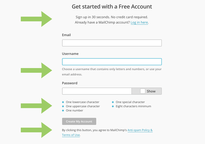
A perfect microcopy example by Mailchimp.
It is instructional text used to explain, direct, or alleviate friction or concerns. If your microcopy is misplaced or poorly written ,you might be confusing your visitors. Microcopy is your chance to answer questions before problems occur, so it’s key to make sure it’s written well.
Unfortunately, only a small group of website managers are actually paying attention to this highly relevant aspect of site design.
This may be due to a lack of understanding about the importance and functionality of microcopy.
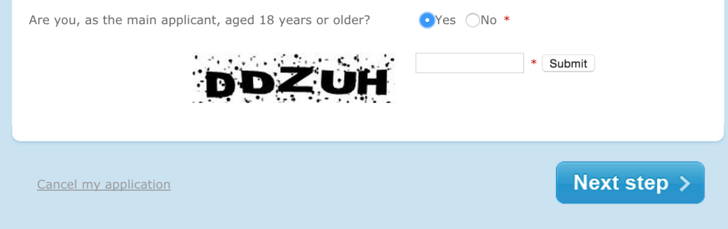
Example of missing microcopy, what do I have to to? Fill in the ‘strange’ letters?
Why Microcopy is So Important
Microcopy is designed to help your users, as it allows you to reach out to them before they even realise they need that extra assistance. It alleviates concerns, directs them to products and services they need, and makes them see that you are looking out for them.
Most businesses concern themselves to a great extent with their marketing attempts, and while that is a wholly valid endeavour, getting people to your site is really just the first step. It is the text , the links , the buttons and the menus that will keep people there. If they can understand how to get what they need, and these needs are met with great products, they will come back. Ensuring that your microcopy encourages ease of use and function will keep your customers returning and will bolster your UX significantly.
Microcopy Rules
There are a few simple rules you should keep in mind about microcopy.
#1 First, test your site on real people.
Listen to the comments they make and carefully consider their suggestions. Here is the issue, most companies design their sites and their microcopy with their own lingo. However, the language that your employees understand, the labelling and functioning verbiage that makes sense to you all, might not be as easily interpreted by the user on the other side of the screen. That is why taking notes during website testing is a good idea. If users are mumbling question marks to the labels you have chosen, chances are, they do not understand the meanings therein.
#2 Next, keep in mind that there are real live people using your site.
These are people who like conversation just like you do. They do not want a bunch of one word labels floating around the page. They want explanations and directions. These do not have to be lengthy, but they should appear somewhat natural and conversational. It is always nice to utilise a site that feels like it has some personal touch to it. Don’t make everything seem like a sterile filing cabinet; who wants to go in there?
#3 Your microcopy must serve its purpose as well.
Realise that it is created and placed on your site for a specified objective, to instruct, direct and/or clarify. Therefore it should be very detailed, utilising the exact terminology you desire. For example, don’t put “submit” when you want a user to “save”. Be precise. Stay away from abbreviations and jargon. Your professional lingo really has no place with the average user. Don’t shorten words that could be easily confused. Again, be precise.
Error Messages: Explain What’s Going Wrong
Error messages are a big deal and therefore you should pay special attention to how they are handled on your site. These can be either hugely frustrating, or can assist your clients. That choice is yours based on the microcopy you supply. There are a ton of different error messages that can occur, but the most important thing is explaining to the user what is wrong and how to fix it. We have all run across errors or glitches, like lightened buttons that can’t be clicked, and realised how irritating it is not to be able to move forward or rectify the problem. Stay abreast of your own site’s possible anomalies.
Example of a not-so-good error message.
Basically, the idea is not to leave the user lost. People want to know why things are not working and what they can do to alleviate the problem. If you can provide your users with an explanation and a way to solve the issue, they will be much happier than those who are left wondering why things got hung up. You don’t have to write lengthy explanations, sometimes a single, “Oops, this page crashed,” can make all the difference. Don’t leave them wondering or they might go somewhere else instead of trying again.
Be super clear what a visitors is doing wrong.
Examples of Great Microcopy
Great microcopy explains what happens next. Users know what to expect and where to go to get it. A great rule of thumb is that an explanation should be able to do its job in eight words or less. Therefore, good microcopy is succinct but poignant at the same time.
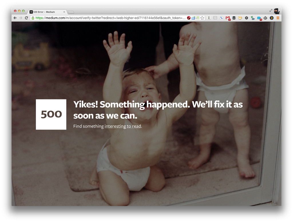
Additionally, a good microcopy creator will understand that branding is everything, but over-branding can hinder as well. Taking opportunities to add your brand tone to an error message or a confirmation message (like Medium’s below) can be a great thing.
Stay consistent with whatever verbiage or design you choose, though, so that the site stays fluid.
If your site has a sense of humour don’t be afraid to show that in your microcopy. Just understand that some situations call for serious answers and not quirky fun jokes. A good example of this is Mojoleaf. They insert a dose of humour saying congratulations for being open to feedback, like that is something to achieve, but keep the focus on getting started. See below:
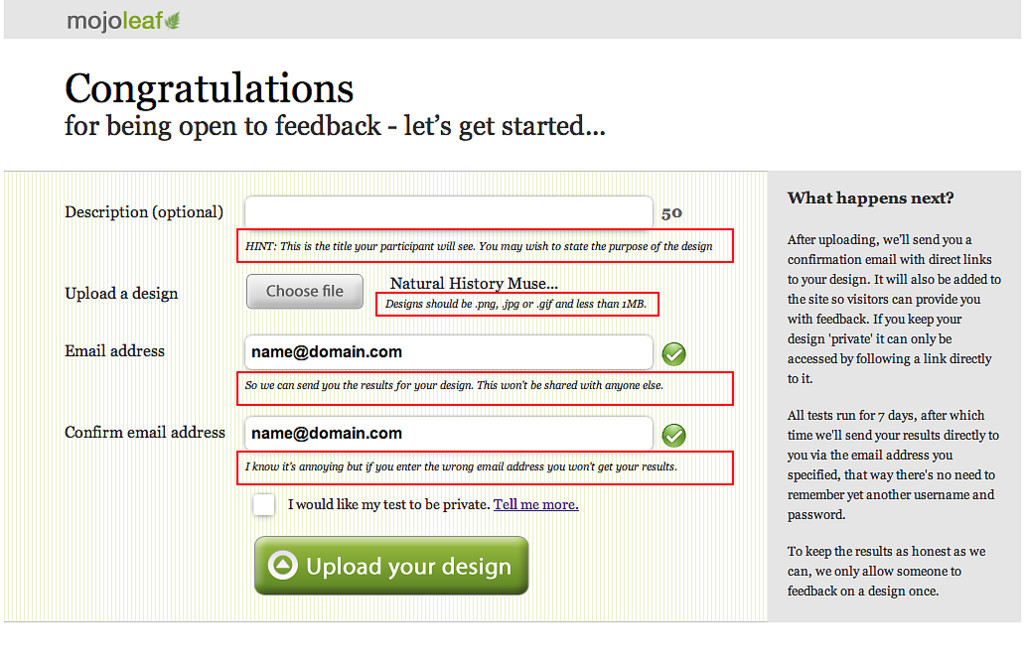 Mojoleaf
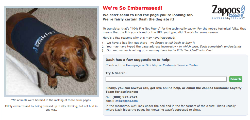 Zappos 404 page
The Bad
Bad microcopy leaves users with far too many questions. They don’t really understand what the next steps are ,or how to achieve what they desire. Perhaps, there are words chosen that don’t actually represent the meaning they are intended for.
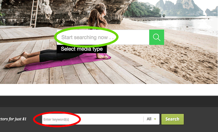
‘Start searching is clearer than ‘enter keywords’. However, giving suggestions might even be better.
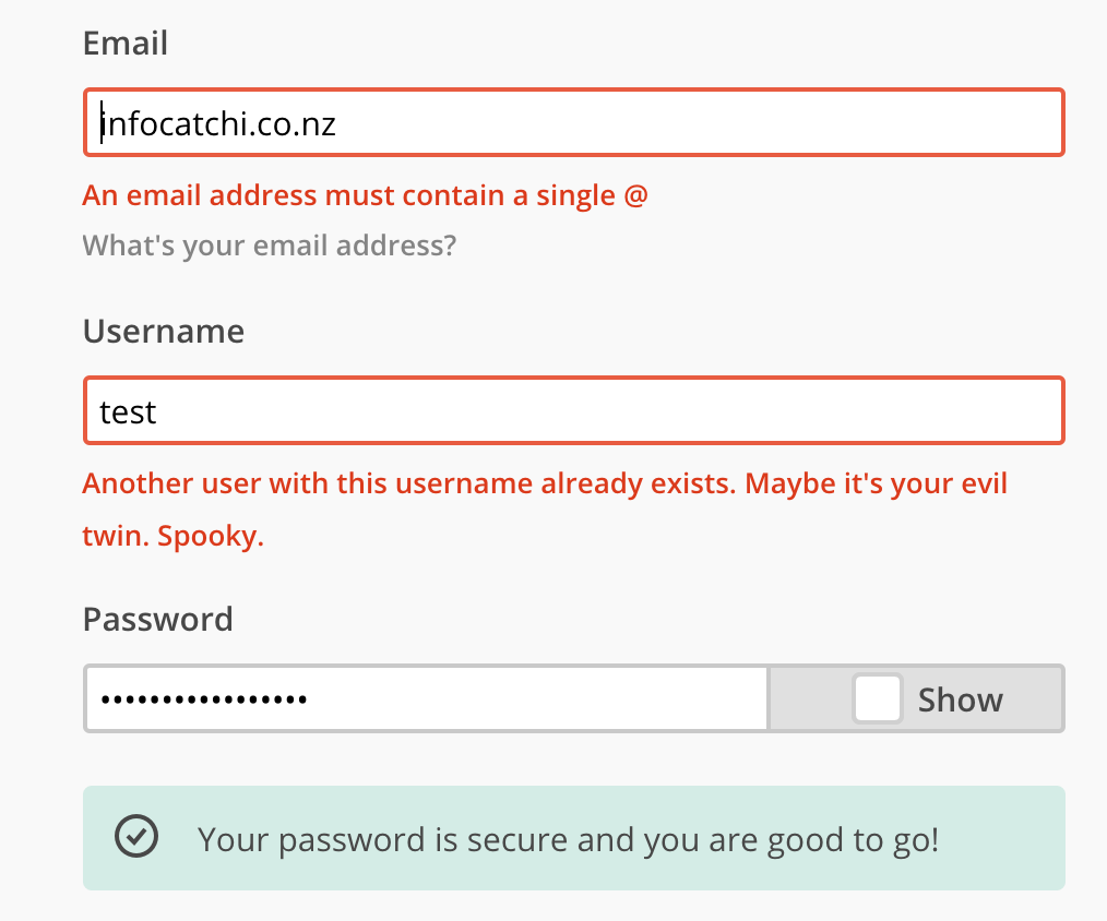
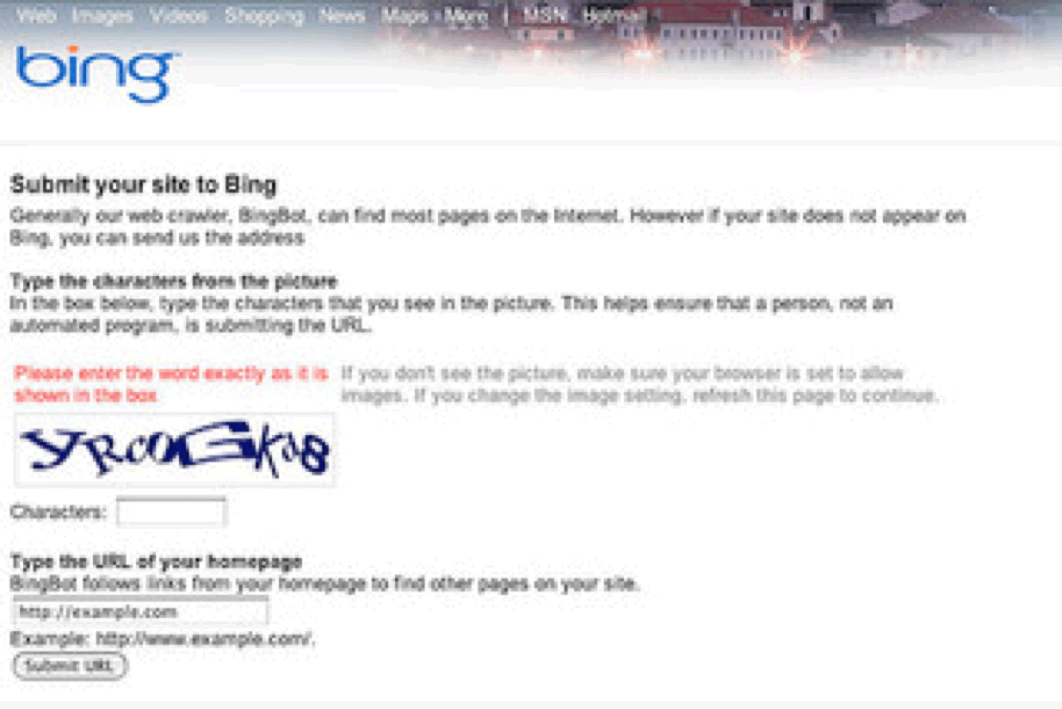
For example one of Bing’s site submission pages asks users to type in the “word” as they see it. However, this is one of those make-sure-you-are-a-real-person validation points and therefore numbers are included. This of course is not a “word” and should read more accurately: “Type the letters and numbers as you see them”. Remember to be precise.
Sometimes microcopy is just lame or missing at all.
Do not assume that every user shares your sense of humour. Blaming a missing page on “Dash the dog,” eating it can be kind of ridiculous (even with the picture of the seemingly guilty dachshund). Also, don’t be redundant, like “This is your login information for the owner user account.” Obviously the user is the owner of that account information. Don’t restate the obvious, be precise; we cannot reiterate that enough.
How To Prevent Bad Microcopy? (tips)
To sum up some of the previously mentioned tips on preventing bad microcopy:
- First, remember that the user doesn’t work for you and is not privy to your industry based lingo.
- Make sure you use language that he/she can readily understand. Talk to your clients like they are right there with you.
- Don’t put all your money on the content thinking it is the end all be all, microcopy is just as important.
- Take every branding opportunity but don’t inundate the user to levels of irritation.
- Ensure that every bit of text works in context and never ever ignore your microcopy, it can make or break your UX.
Microcopy is far more significant than most business professionals realise.
No doubt, this is partially due to the overly intense focus on marketing and basic content. While users aren’t going to read the Lorem Lipsum, they also aren’t going to hang out on a site that doesn’t make sense. The key to microcopy is succinct precision. Say what you mean and mean what you say. Let people know how to get what they want. That’s microcopy in a nutshell.