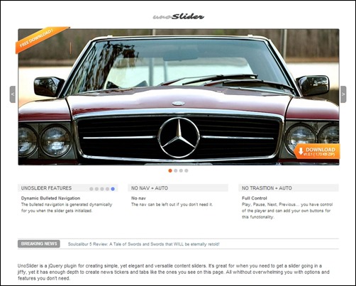
We’ve all seen them. The sliders across the top of web pages that rotate offers, product features and the like.
These rotating sliders have caught on like skinny jeans. However, are rotating sliders efficient? Will they actually help convert visitors into customers? This is an important question being that they typically take up prime real estate on landing pages.
The truth about rotating sliders is that they often accomplish the opposite of what is intended. They distract, disorient and frustrate visitors.
.gif)
Let’s discuss the rotating slider in more depth, what research says and look at an alternative strategy that will convert more visitors into customers.
Common Reasons Why People Use Rotating Sliders
Marketers and designers typically have a few different motivations for using rotating sliders which include the following reasons:
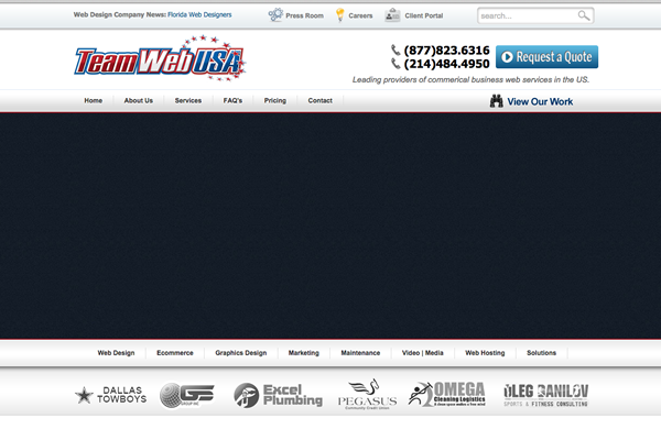
- They are accommodating. Designers are often under pressure from many different departments who want to incorporate competing interests on the front page. Rotating sliders offer the ability to feature multiple messages. This also allows a company to maintain a vague idea of their key value proposition, which is easier. See this example of a web design company:

They have several key offers including SEO, mobile website design, ecommerce design, etc. The first thing I saw when I got to the site was a big black rectangle. The slider was the last thing to load. (This is common) Then the rotating images begin. Each slide has a title and bullet points for the point. However, the messages are hard to read thoroughly before the banner changes. The customer is left feeling that they have many decisions to make.
- Another reason why rotating sliders are commonly used is because they are familiar. Designers are often familiar with designing them and clients have come to expect to see them. As a result, clients may insist that one is used on their site, despite being advised otherwise.
- Then there is the cool factor. Some clients think the look and functionality is a cool addition to their site. Unfortunately, cool doesn’t always make money.

So, Why Do Sliders Not Work?
Despite rotating sliders being such a popular choice, studies have proven they don’t work optimally. We have developed an expectation of visitor behavior that simply isn’t true. Here are the reasons why:
#1 The Cold Shoulder
Sliders don’t work because they are inefficient. A study completed by using A/B testing and eye tracking suggests that people do not interact with rotating banners. In the study, when a static image replaced a rotating banner, the click through rate increased. For a space that takes up a large amount of the page, a slider turns out to be detrimental.
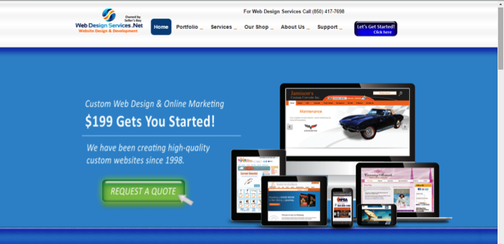
See this alternative example of a static home page: https://www.webdesignservices.net/.

The first thing you see is their key marketing message and a call to action. There is no waiting for the message to load and the directive is clear for visitors. When compared to the rotating banner, a lot of the work on the part of the customer is removed. The customer doesn’t need to look through all the services, see what they want and add up the costs. This key offer, a price to get started and a button to click for a more detailed quote.
#2 The Banner Effect
Sliders are inefficient because visitors often see them as banners. Unfortunately, it has been shown that people ignore and skip over banners. Companies often expect users to sit back and watch banners like they would watch a TV show. However, most visitors do not want to take a significant amount of time watching flashing images on a screen. They want information on their search to be served as clearly as possible.

#3 They are disorienting
Rotating banners have also been shown to distract and disorient visitors. Due to the fact that the human eye reacts to movement, visitors can be distracted from important information elsewhere on the page. Unless the rotating slider is the only thing on the page, you definitely don’t want your readers being distracted from other content.

#4 Low Click Through Rate Past 1st Slide
One study demonstrated that only one percent of users clicked on a slide in a rotating banner, and out of those clicks, 84 percent clicked on the first slide. So if you want information buried in a website, a rotating banner is the way to do it.
#5 Not User Friendly
Too often, a visitor ends up on a website, starts reading the first slide of a rotating banner, and then the next slide appears, rendering the first slide useless. Unfortunately, the sliders are too fast for people to finish reading or even click on them.
One study conducted on the effectiveness of slides found that moving elements reduce the accessibility to those users with low literacy, international users and low motor skill users. Many feel annoyed or frustrated with the interface.
The Static Solution
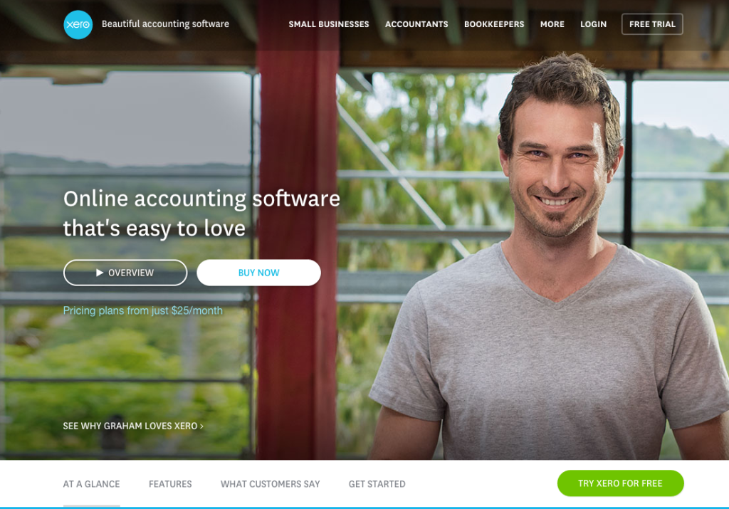
Instead of offering rotating information via a slider, it is recommended that you use a static hero image at the top of the homepage. The image should contain the key value proposition communicated clearly as in the example. The homepage should include a clear call to action that is focused and helps the visitor move through the website efficiently. Having a static message on the homepage, keeps things simple and easy for the visitor as was demonstrated.

Remember the Goals of the Home Page
When designing a homepage, it is essential to remember the main goal. First, the website should explain the top-level information about who you are and what your company offers. This information should be presented in a way that builds trust, yet also engages the visitor in a way that he will continue browsing. If your website has a relatively high bounce rate, then consider if it is accomplishing and delivering the information that the visitors expect.
Clear Value Proposition
When a customer lands on your website, they often scan the page for information to determine if it is worth their time to explore your website. Most of the time, this takes about six seconds. So you’ll have about six seconds to satisfy the need of the customer to stay on the page and deliver the value proposition. The information presented shouldn’t be an extensive piece of copy. Instead, it should be a clear tagline that is about 2-3 sentences long and should be supported by a strong, relevant design.
It’s important to understand that the homepage functions as a portal to other key pages of the website. Clear options and choices should be offered to guide visitors through your website and help them make browsing decisions along the way.
Clear Path to Conversion
When a customer looks at the homepage, it should result in a “yes” and it should also be the first “yes” in a long chain of “yesses.” A “yes” should lead them to more information about a specific topic presented to them. The first “yes” is the most crucial because this is what often keeps them on the website.

Clarity Needs to Come First
One of the biggest mistakes a company can make is to put a slider in place that is vague and indecisive of the key message. Doing so allows organizations to avoid making decisions as to what key information should be displayed on the homepage. Instead, they leave it up to the customer to find the offer they are looking for. Customers don’t want to do this. They want a clear cut solution.
To resolve the unclarity that a rotating slider offers, it is imperative that decisions be made in terms of priorities.
Companies will need to create clarity around a key value proposition. The more detailed options should be introduced after the initial click through.
While it may seem daunting at first, the process of clarifying is important and you will probably be amazed at the focus and success it brings. When information is clarified and kept simple, an effective home page will emerge. Instead of a rotating slider, what you will have is an effective homepage design that has the ability to bring visitors deeper into your site and convert them into customers.
While rotating sliders are still used frequently, you can be sure that web designers are starting to develop and implement strategies for avoiding them. When it comes down to it, they just don’t work well. It is not about trying to be cool, doing what is popular or doing what is easiest; do what works! Say no to rotating sliders and yes to static home pages with a short focused message and a clear call to action!


