
Your train is arriving in 3 minutes. Quickly, you pull up the train’s website on your phone to figure out which platform to head to. The seconds tick by as you scroll anxiously through the site, clicking on links that will lead you to that one vital piece of information you need. Finally, you find it – but it’s much too late. While you were spending precious minutes scrolling through the site, the train has whizzed on by…
Responsive Websites
Are Not Enough
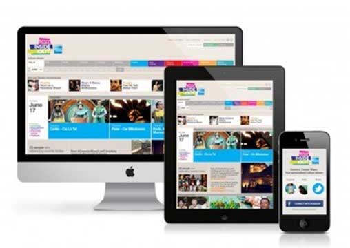
How many of your customers experience a similar situation when they go to your site from their mobile device? Most will say “But my site is responsive!”. Well, responsive web design focuses on building websites where the user experience of viewing and interacting with the website is optimized. This means that the site is easy to read and simple to navigate without much resizing, scrolling and zooming in and out, no matter which device they are on. However, the current understanding of responsive websites focuses mainly on viewing experience and screen resolutions.
Designing mobile websites should go way beyond that. People use different devices for different reasons – take the scenario where you are looking up your train platform information. Even if the website is mobile responsive, that wouldn’t make much of a difference if the information you need is embedded deep within the site and not easily accessible. Responsiveness needs to take into account the types of situations people are in while they are on their different mobile devices – and the design of the website should respond accordingly.
Source: https://www.diversifiedconcepts.biz/websites-web-design-services-austin.html
Note how the mobile version displays minimal content with easily clickable buttons, prioritizing the most important and pertinent information.
Google knows Responsive Design Very Well
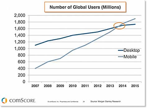
Having your site rank highly on Google helps drive traffic to your site, and having a responsive design is key to that. Google has stated unequivocally that mobile friendliness is an important ranking factor in their algorithm. This makes perfect sense as more and more people are using Google on their mobile devices than their desktops, as you can see in the graph below. More Google searches take place on mobile devices than on computers in 10 countries including the US and Japan.
Source: http://www.smartinsights.com/mobile-marketing/mobile-marketing-analytics/mobilemarketing-statistics/
Google also displays result differently for the same search depending on the device used to make the inquiry and the likely situation of the user on the other end. For example, when I searched for ‘wrecked’ on my PC, I got the following results.
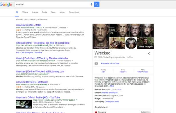
As you can see, I am given a lot of information all at once. Google is assuming I have time to see everything at once and find what I want. They have assumed I am not in a rush and don’t need my options prioritized for me. When I did the same search on my smartphone, I got these results.

I am first and foremost offered the option to share about the film to a variety of social media profiles. This shows Google is considering that the user on the go has various social media accounts that they use to stay in touch with others and they are likely wanting to share this particular movie. Then I am given the image of the film which quickly tells me users they are getting information about this specific film. Lastly, I get film ratings, helpful for people quickly wanting to find out if the movie is worth watching (maybe sitting on the couch browsing Netflix, or at the movie rental store). As you can see, it is not only about having the content be the right size for the screen, it is about delivering prioritized information which considers the situation of the person inquiring.
Your website should respond to “situations”, not to “resolutions”
While a responsive web design adapts to screen resolutions, it shouldn’t stop there. A truly responsive website should also deliver content to cater to different situations. Here are some examples of websites successfully demonstrating this concept.
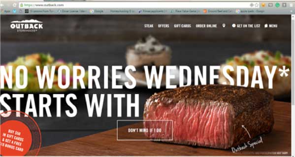
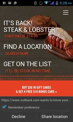
Example 1: Outback Steakhouse
PC: The homepage is dominated by an image of a juicy steak, with links on the menu on the top right-hand corner. This layout gives the user all of the information they may want at once. You can get gift cards, order online, check the menu, make reservations, read about their steaks and more. This is suited for someone with time to look around from a PC.
Mobile: On the mobile version, we see the most important links displayed – find the nearest Outback locations, the latest deals, and just a click to join the mailing list. We all see a request to find out my location so results can be more specifically customized to my needs. This is perfect for those on the go and needing to make a quick reservation or find the nearest Outback, this page would give the information quickly and efficiently. Now imagine a mobile version with all of the information from the PC. It would not be as effective.
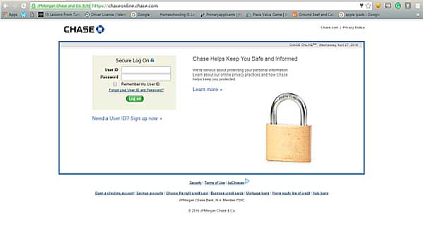
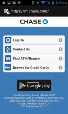
Example 2: Chase Bank
PC: The page provides a login page to internet banking.
Mobile: The mobile version provides more links to different services other than internet banking – there’s also a handy ‘Contact Us’ button, the option to locate different ATMs or branches, as well as to browse for credit cards. These options take into consideration what people may need from Chase while out and about.
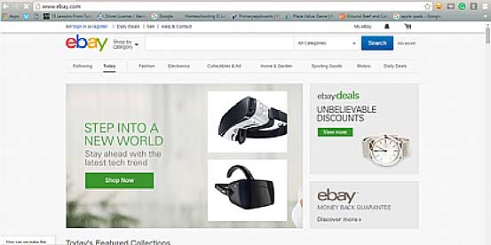
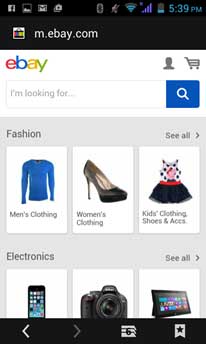
Example 3: eBay
PC: eBay’s desktop version provides a variety of links, with the majority of the screen taken up by various deals and attention-grabbing products.
Mobile: The mobile version leads the user straight to the search bar, with different product categories for easy browsing. It breaks down what you may be looking for with easy to click image buttons. Notice the PC page has smaller links for products, more easily clicked with a mouse.
All of these are examples of how design should not only be changed to fit the screen where the site is being viewed, but should respond to what the visitors from specific devices will likely be looking for.
This is the most important thing you have to do if you want to optimize your “mobile” revenues
Start by creating a ‘needs map’, which is a list in Excel of your customers’ needs based on the device they are using. Then, link this map to specific call to actions. This is how you ensure that your website can be designed around your users’ needs. Steve Jobs said it best: “You’ve got to start with the customer experience and work backwards to the technology.”
Test before you deliver. Use Conversion rate optimization strategies to a/b test your hypothesis
- To maximize your efforts, it’s wise to test as you develop. Create different layouts and run a/b tests on your audience to find out which is more effective.
- Plan your design for a specific ‘situation’, not device. Think about where and why the user is accessing your website on their mobile device: it could be a person who’s getting off work and on their way to your store, and wants to find out the nearest store location to where they are, or it could be someone who’s running errands and wants to make a quick dinner reservation at your restaurant. This determines how you should organize the information on your mobile website. Then, test the different situations in you’re a/b tests to find out which converts at the highest rate.
- When tracking the analytics for your site, think about the most relevant goals to track. If customers are using the mobile site to find your store location and not to make purchases online, it would make more sense to track user behavior that’s not related to online sales. This will help you find what to track to lead to an ultimate rise in conversions
- Test your website on a specific audience – those who are on the devices that are most likely to be in the situations that you’ve identified. During you’re a/b tests you want to be sure you are targeting the right audience.
- Keep in mind that each device has its own specific uses. Mobile is not a tablet. Desktop is not mobile. And the tablet is not desktop – treat them as their own unique device. Be sure to identify the situations for each respectively.
- Preview your website on the actual device, and not on online preview tools in order to get an accurate feel of how it works in real life.
Don’t get me wrong. Resolutions are very important

While it’s still important to make sure a website is of high quality across all devices and designing websites to display well on higher resolutions is key to that, the point to take away is it’s not the only thing to consider. Businesses also need to consider the following factors when designing their websites:
- Page Load A user (57% of mobile customers) is likely to abandon a website if it takes more than 3 seconds to load. 71% of mobile web users expect a website to load on their mobile devices as quickly, or even more so, than on the desktop. When you need information fast – like when you’re looking up train departure information – you don’t have time to wait around! (Source: Strangeloop Networks, 2013)
- Situations Mobile websites need to cater to diverse needs, and not just be provide an optimized checkout funnel. Keep in mind that about 50% of consumers use a mobile site before making a purchase in-store – they could just be trying to find out a physical store location before coming into to make a purchase. Not catering to their needs could result in lost revenue further down the line. (Source: Deloitte 2013 and others)
- Design Good design is important to consumers – 57% said they will not recommend a business with a poorly designed mobile site while 41% will go to a competitor if they have a bad mobile experience. It’s clear to see that customers will lose their brand loyalty quickly when faced with a bad design and poor strategy across devices. (Source: Google)
Link resolutions with situations
Ultimately, you want your design to respond to devices, as well as the situations that the users are in. Optimize your strategy for maximizing your online revenue by identifying the most common “re-situations”, which are resolutions and corresponding situations. Don’t forget to get real feedback from your users – there are many smart and useful tools available that can help you do this. By considering users’ situations, you will be able to create a website that can effectively meet their needs.
Now let’s re-imagine this scenario: your train is arriving in 3 minutes. You pull up the train’s website. A search field pops up where you enter your train information. 3 seconds later, you’re on your way to the platform, with a minute to spare before your train arrives. Now that’s a truly responsive design.