About Stray:
Stray based in Auckland, NZ offer their customers a variety of Hop-on hop-off flexible guided bus transport passes around New Zealand that is ideal for adventurous travelers to explore New Zealand. They have 13 National Passes, 7 North Island passes, and 8 South Island passes. Stray’s main point of difference is that their routes get travelers “further off the beaten track” and staying at unique locations which their competitors wouldn’t offer. Hop-on hop-off means that the customer is able to jump on and off anywhere along their pass route for any amount of time. The passes are valid for 12 months from the first day of travel. All routes are guided – the driver is the guide and provides commentary as well as booking customers’ accommodation and activities (at a discount).
Stray’s audience are tourists, backpackers and New Zealanders wanting to explore New Zealand in a cost effective, flexible way with the convenience of not having to drive and being guided along the way. Stray customers are predominantly 18-45 years old and the indication is that 50% of potential customers are in the 25-34 age brackets.
The Challenge:
With their website being the shop window for their world-wide audience, the aim for our project was to increase pass sales online and over the phone. Secondary objectives were to increase the usability in terms of finding the right pass and the best information to guide them along to a decision and offering a clear, easy way to complete the checkout process. Visitors needed to be able to view each pass and its key features easily and get excited about travelling with Stray, this to make an informed decision to go with Stray and book online.
The Solution:
Our initial website assessment using our unique Catchi Method yielded a number of key recommendations on how to improve conversion rates and user experience. Based on this assessment we created a clear testing plan, outlining which tests we suggested running on which pages and sections of the website. The goals was to improve the funnel visitor go through in terms of clarity and flow and increase the appeal of the offering. Of particular focus in this respect were the homepage, the pass details pages, the deal page and the bookings process.
The Outcome:
Nov 14 – Jun 16 year on year
Over the period of the CRO Programme we have seen the site’s bounce rate decrease by 18%, the time on site increase by over 16% and the eCommerce conversion rates increase by 13%. On the next page there are two experiments listed that have been part of a series of complete series of experiments as part of a full CRO Programme that have resulted in this amazing results.The first one was the deal page and the second one the booking page.
Jan – Dec 2015 year on year
Over the period of the CRO Programme and the following 6 months we have seen the site’s bounce rate decrease by 11%, the time on site increase by 14% and the eCommerce conversion rates increase by 28%. On the next page there are two experiments listed that have been part of a series of complete series of experiments as part of a full CRO Programme that have resulted in this amazing results. The first one was the deal page and the second one the booking page.
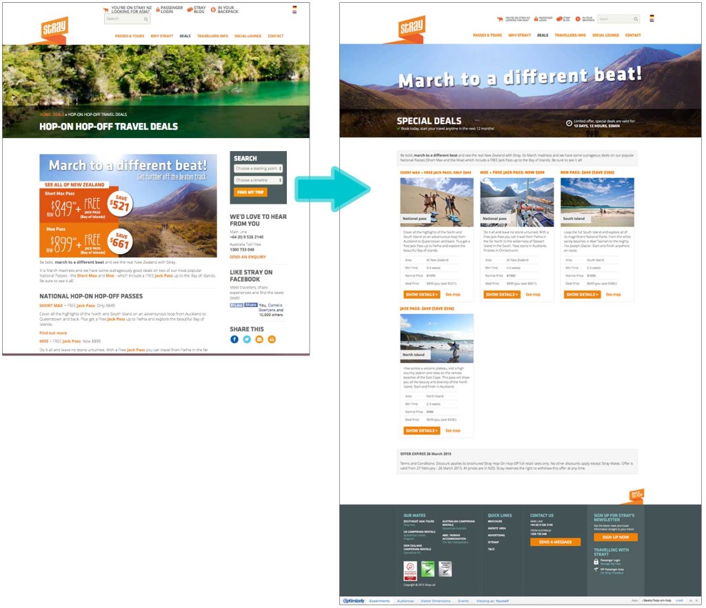
Deal page:
Looking at the number of confirmed bookings, we can clearly see that the three-column design performed better than the original (next page). The variation increased booking by over 90%.